If you’ve ever tried to find that soft, muted, calming blue you’ve seen in wedding themes, interior design magazines, or stylish websites — you’re likely thinking of Dusty Blue. It’s subtle, elegant, and incredibly versatile. But when it comes to using it digitally or in print, you’ll need its exact color code.
In this article, I’ll walk you through everything you need to know about dusty blue: its HEX, RGB, and CMYK codes, how to use it in design software, real-life applications, matching color combinations, and much more.
Whether you’re a graphic designer, decorator, event planner, or just curious about this beautiful shade, you’ll find this guide useful and easy to follow.
What is Dusty Blue?
Dusty blue is a cool, soft shade of blue with gray undertones. It’s not bright like sky blue or dark like navy — it falls somewhere in between, offering a calm and vintage look. It feels timeless and elegant, making it a favorite in the world of design.
You’ll commonly see dusty blue in:
- Wedding color themes
🔗 See full Dusty Blue Wedding Palettes for inspiration - Interior decor (pillows, walls, upholstery)
🔗 Also read: Dusty Blue Wall Paint Ideas for your interiors - Website and branding design
- Stationery and fashion collections
Its muted tone makes it ideal for minimal, romantic, and sophisticated aesthetics.
Why Do People Search for the Dusty Blue Color Code?
Many people see a beautiful color and want to recreate it in their digital work, print designs, or even physical paint. However, “dusty blue” isn’t a standardized color name in all software or design tools. That’s why you need its exact color code to apply it properly.
You might be designing an invitation, a website banner, or even choosing fabric or wall paint — and that’s where this guide comes in handy.
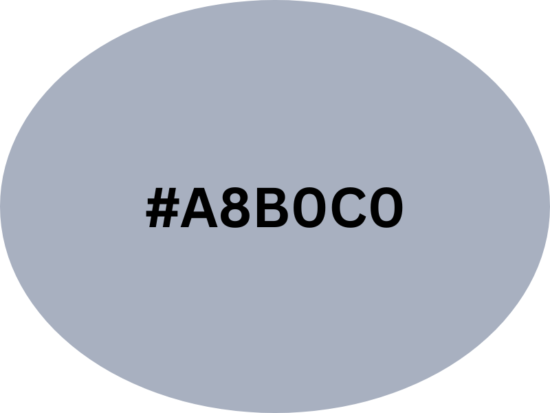
Dusty Blue Color Codes (HEX, RGB, HSL, CMYK)
| Format | Code |
|---|---|
| HEX | #889BAE |
| RGB | rgb(136, 155, 174) |
| HSL | hsl(210, 20%, 61%) |
| CMYK | 22%, 11%, 0%, 32% |
| Pantone | Pantone 5445 C (approx.) |
Try our Dusty Blue Color Palette Generator to explore beautiful combinations.
These codes help you use dusty blue in web design, print media, and graphic editing software. Use HEX for web, RGB for screen design, and CMYK for printed materials.
You can explore variations and palettes on sites like Encycolorpedia or Color-Hex.
Dusty Blue Color Variations (Swatch)
| Name | HEX | Notes |
|---|---|---|
| Classic Dusty Blue | #889BAE | The base color in this guide |
| Pale Dusty Blue | #A8C3D1 | Lighter, airier tone |
| Muted Sky Blue | #9FB2C6 | Slightly brighter |
| Dusty Denim | #6A7D8A | A deeper, cooler variation |
| Dusty Blue Gray | #95A4B2 | Neutral with more gray |
How Does Dusty Blue Compare to Other Blues?
Understanding the difference between dusty blue and other similar shades helps you use it more effectively.
Sky Blue – Brighter and lighter, often used in children’s themes
Steel Blue – Has a deeper gray tone and feels more industrial
Slate Blue – Slight purple undertones
Powder Blue – A pale version, less muted than dusty blue
Dusty blue sits between all of these — muted but still rich in depth, making it suitable for both modern and vintage-inspired designs.
Where Is Dusty Blue Used? Real-World Examples
1. Weddings
Dusty blue is one of the most popular wedding colors in recent years. It works beautifully in:
Bridesmaid dresses, floral arrangements, invitation designs, table linens, and decor backdrops.
🔗 See full Dusty Blue Wedding Palettes
2. Interior Design
In home decor, dusty blue works well on:
Accent walls, sofa cushions, curtains, and bathroom tiles.
🔗 Check out Dusty Blue Wall Paint Ideas
3. Web and Graphic Design
If you want a peaceful yet professional vibe in your branding or website, dusty blue is a great choice.
It pairs well with serif fonts and light backgrounds to convey trust and balance.
Best Dusty Blue Color Combinations
| Combination | Effect & Use Case |
|---|---|
| Dusty Blue + Blush Pink | Romantic, great for weddings & fashion |
| Dusty Blue + Sage Green | Earthy and calm for boho or natural themes |
| Dusty Blue + Navy Blue | Elegant and layered for branding |
| Dusty Blue + Gold | Luxurious, works for invites & packaging |
| Dusty Blue + Cream/White | Airy, perfect for minimalist web and decor |
Design Tips for Using Dusty Blue
- Balance with neutrals: Use dusty blue as the highlight shade with whites or grays to avoid overpowering the design.
- Use metallic accents: Gold, rose gold, or copper adds elegance when combined with dusty blue.
- Avoid too many bold colors: Dusty blue is soft. Combining it with too many bright or clashing shades can ruin its calming effect.
- Think of lighting: In physical designs, the lighting can make dusty blue look cooler or warmer. Always test samples if you’re painting or printing.
Mini Guide: How to Use Dusty Blue in Design Software
1. In Canva
- Open your design file.
- Select the element you want to color.
- Click the color box > Click “+” to add a new color.
- Paste the HEX code
#889BAE. - Press enter. Your element will now display the dusty blue color.
2. In Adobe Photoshop
- Select the object or background you want to change.
- Click on the foreground color box.
- Enter the HEX code
#889BAEor the RGB values. - Click OK and fill the selected area with your brush or paint bucket.
3. In CSS (Web Design)
body {
  background-color: #889BAE;
}
h1 {
  color: rgb(136, 155, 174);
}
This allows you to maintain consistent branding across your website.
FAQs About Dusty Blue
Is dusty blue a warm or cool color?
Dusty blue is a cool-toned color because of its blue and gray components. It pairs well with both cool (like silver or sage) and warm accents (like gold or blush).
What’s the difference between dusty blue and slate blue?
Slate blue tends to have purple undertones, while dusty blue is more muted with grayish-blue tones.
Can dusty blue be used in logos or branding?
Absolutely. It creates a calm, trustworthy, and clean look — ideal for wellness brands, consultants, or modern eCommerce sites.
Is dusty blue suitable for both genders?
Yes. Its neutrality and softness make it suitable for all genders. It’s also often used in gender-neutral baby showers and fashion.
How can I preview dusty blue online?
You can use tools like PaletteMaker or ColorKit to test the color on different palettes.
Conclusion
Dusty blue is more than just a trendy color — it’s a timeless shade that brings a sense of calm, elegance, and quiet sophistication wherever it’s used. With its soft gray undertones and muted blue base, this color creates a feeling of balance and tranquility that works beautifully in both modern and classic styles. It’s not overly bright or overpowering, which makes it incredibly flexible and easy to incorporate into all kinds of projects.
Whether you’re designing a minimalist website, planning a romantic wedding palette, building a cohesive brand identity, or simply updating your home decor, dusty blue adapts effortlessly. It pairs well with neutrals like ivory and beige, metallics like gold and silver, or richer tones like rust, blush, and sage green — giving you endless combinations to work with. This versatility is exactly why it continues to be a favorite in everything from fashion to interior design. If you’re looking for a color that’s subtle yet impactful, dusty blue is always a beautiful, smart choice.
With the correct codes and thoughtful pairing, dusty blue can bring elegance and serenity to your creative work.
🔗 For more guides and color inspiration, visit our homepage
Hi, I’m Anwar Malik — a design lover and website creator who’s always been drawn to soft, timeless colors like dusty blue. I started this site to share ideas and inspiration for anyone who loves using calm, elegant tones in fashion, decor, or events.
With my background in web development and visual styling, I enjoy turning color ideas into helpful content. Whether you’re planning a wedding or just looking for styling tips, I hope you find something useful and beautiful here.