Dusty blue and gold is a color combination that instantly feels elevated — soft yet sophisticated, calm yet rich. Whether you’re planning an elegant wedding, designing a luxury brand, or decorating a formal space, this duo has everything you need for a timeless, refined look.
In this guide, we’ll explore exactly why dusty blue and gold work so well together, how to use this palette in different settings, and five carefully designed color combinations with HEX codes. You’ll also find expert styling tips, branding applications, and helpful resources to bring this color pairing to life in your own way.
Why Dusty Blue and Gold Work So Well Together
Dusty blue sits in the soft, muted end of the blue spectrum — gentle, powdery, and calming. Gold, on the other hand, brings a warm, metallic accent that adds a sense of richness, warmth, and classic elegance. When paired together, they strike a perfect balance between cool and warm tones.
This makes the combination incredibly versatile. You can go light and romantic with cream accents, or dramatic and moody with navy or charcoal. It adapts to weddings, branding, fashion, packaging, and even interior design.
Psychologically, blue symbolizes trust, clarity, and calmness. Gold represents luxury, value, and prestige. When used together, the emotional impression is powerful: approachable yet elevated.
Dusty Blue and Gold in Weddings: A Classic Match
One of the most popular uses for this color combination is in weddings. From bridesmaid dresses and table settings to florals and invitations, dusty blue and gold can create a dreamy, refined atmosphere that works beautifully in any season.
1. Classic Dusty Blue + Gold + White
This timeless palette combines soft dusty blue fabrics with metallic gold accents and crisp white details. Think ivory linens, dusty blue bridesmaid dresses, gold flatware, and candle holders. This look feels clean, fresh, and undeniably elegant.
2. Dusty Blue + Gold + Greenery
Add fresh greenery to the mix, and you instantly have a romantic outdoor palette. Perfect for garden weddings or rustic-chic barn venues, this color trio works wonderfully with eucalyptus leaves, natural wooden decor, and soft linen textures.
3. Dusty Blue + Antique Gold + Cream
If you’re after something more vintage and warm, consider replacing bright yellow gold with antique gold or brass tones. Paired with dusty blue and creamy neutrals, this palette feels old-world, nostalgic, and very sophisticated — ideal for vintage-style calligraphy invitations or heirloom wedding decor.
For more seasonal wedding inspiration using dusty blue tones, you might enjoy this article on dusty blue wedding color palettes & styling ideas.
Using Dusty Blue and Gold in Branding & Design
While it’s popular in events, dusty blue and gold also translate beautifully into design and branding — especially for businesses that want to feel high-end, creative, and calm all at once.
1. Luxury Packaging
Cosmetic, fragrance, skincare, or jewelry brands often use soft blue packaging with gold foil accents. Dusty blue evokes purity and gentleness, while gold adds a premium, polished touch. Use matte finishes, embossed logos, and subtle patterns to complete the look.
2. Logo & Typography
A dusty blue background with gold serif typography creates a refined, upscale feel. This combination works well for wedding vendors, interior designers, boutiques, and lifestyle brands. Minimalist logos with clean lines, gold embossing, and soft color gradients are especially effective.
3. Website Color Palettes
Dusty blue and gold can also work in digital design. Use dusty blue for hero sections or banners and gold for accent buttons or icons. A white or pale gray background can keep things clean and easy to read while maintaining a soft luxury aesthetic.
For practical application and examples, check out this helpful article on dusty blue color matching for clothes, decor, and styling.
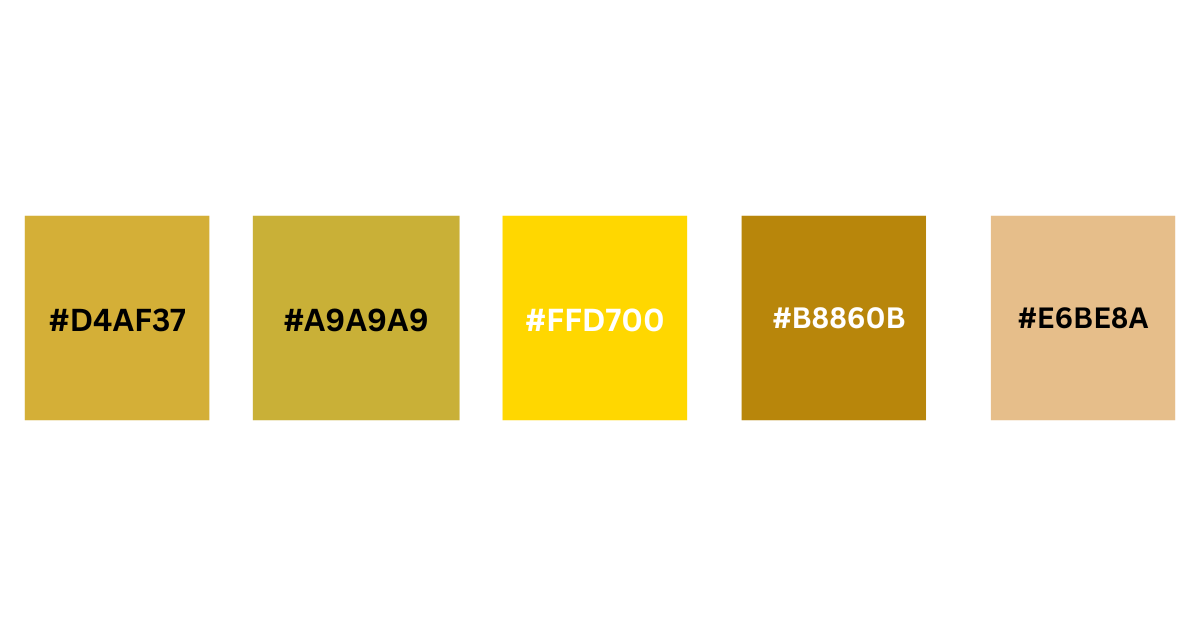
5 Ready-to-Use Dusty Blue and Gold Color Palettes (with HEX Codes)
Below are five unique dusty blue and gold palette examples with HEX codes. Each one is designed for different moods and use cases — from weddings to branding to packaging.
| Palette Name | Dusty Blue | Gold | Accent 1 | Accent 2 |
|---|---|---|---|---|
| Elegant Ivory | #A8C5D1 | #D4AF37 | #FFFFFF | #2C3E50 |
| Vintage Luxe | #9CB7C5 | #C9B037 | #F5F5DC | #7F8C8D |
| Minimal Gold | #B0C4CE | #FFD700 | #FAFAFA | #333333 |
| Nature Chic | #9EBACD | #B8860B | #DDE7E5 | #3E4C40 |
| Romantic Glow | #ADC5CF | #E6BE8A | #FFF8F2 | #8B6F4E |
Each of these palettes can be used across invitations, social media graphics, product packaging, or even interior styling. Try uploading these HEX codes into tools like Coolors or Adobe Color to explore more combinations and variations.
Interior Design Ideas Using Dusty Blue and Gold
While dusty blue and gold are common in events and branding, this color scheme can also be used in home decor to create an elegant and restful space.
Bedroom
Dusty blue bedding paired with gold accent pillows or a metallic lamp can give your bedroom a calm yet luxurious vibe. Add creamy white walls or curtains to keep the look light and balanced.
Living Room
Try a dusty blue couch or rug as your main statement, then sprinkle in gold details through picture frames, side tables, or lighting fixtures. This combo works well with marble surfaces or warm wood tones.
Office Space
Want a workspace that feels both productive and aesthetically pleasing? Use dusty blue for your desk accessories or chair upholstery, and gold for hardware and lighting. This can help the space feel refined without being distracting.
Styling Tips: Getting the Balance Right
To make dusty blue and gold work well in any setting, keep these tips in mind:
Use Gold as an Accent
Gold is best used in moderation. A little goes a long way — think decorative trims, small decor pieces, text highlights, or metallic foil. Too much gold can overwhelm the softness of dusty blue.
Mix with Neutrals
To prevent the palette from feeling too cold or too rich, add neutrals like cream, white, taupe, or soft gray. These colors act as a backdrop and keep the main colors from competing too much.
Don’t Forget Texture
In events and decor, texture adds dimension. Think velvet fabrics, silk ribbons, matte papers, embossed finishes, and brushed gold metals. Texture gives life to the colors and helps create depth.
Match the Mood
Use softer golds (like champagne or antique gold) for vintage or romantic moods. For more modern or upscale looks, go for sharper, brighter golds. Always pair with the right shade of dusty blue — lighter for airy looks, deeper for moody vibes.
Great Resources to Explore More
Here are a few useful external tools and inspiration sources to help build your dusty blue and gold projects:
- Canva’s Color Palette Generator – Create your own palettes using uploaded images or HEX codes.
- Coolors.co – An easy way to generate color schemes and export palettes.
- Adobe Color – A professional-level tool for exploring harmonious color relationships.
- Design Seeds – A collection of curated color inspiration based on photography.
These tools can help you create mockups, branding kits, event mood boards, and interior palettes.
Frequently Asked Questions
What colors go well with dusty blue and gold?
Besides dusty blue and gold, you can add cream, white, soft gray, beige, or deep navy to complete the palette. For nature-inspired looks, eucalyptus green or taupe also works beautifully.
Is dusty blue and gold a good color combination for weddings?
Yes, dusty blue and gold is one of the most elegant and popular wedding color combinations. It works well in every season and suits various styles—from classic and romantic to modern and minimalist.
Can I use dusty blue and gold in branding?
Absolutely. This palette is perfect for luxury branding, especially in industries like fashion, skincare, interior design, or creative services. Use dusty blue for the background or primary color, and gold for accents, logos, or typography.
What shade of gold looks best with dusty blue?
Both bright metallic gold and antique (muted) gold pair well with dusty blue. For formal or modern looks, use sharp yellow-gold. For vintage or romantic vibes, try soft champagne gold or brushed brass tones.
Is dusty blue warm or cool-toned?
Dusty blue is a cool-toned color with muted, grayish undertones. It pairs well with warm metallics like gold, which creates a balanced and visually appealing contrast.
Where can I use dusty blue and gold in home decor?
You can use this palette in living rooms, bedrooms, dining areas, or home offices. Try dusty blue curtains or rugs with gold accent lighting, frames, hardware, or side tables to bring a soft, stylish look to your space.
How do I create a dusty blue and gold palette with HEX codes?
You can use tools like Coolors, Adobe Color, or Canva’s color palette generator to create your own palette. Just enter HEX codes like #A8C5D1 (dusty blue) and #D4AF37 (gold) to get started.
Final Thoughts
Dusty blue and gold is more than just a beautiful color combination — it’s a versatile, emotionally balanced palette that works across industries and occasions. It communicates calmness, elegance, and timeless sophistication, whether you’re dressing a wedding venue or building a luxury brand identity.
With the right balance of soft blue tones and glowing gold accents, you can create spaces, designs, and experiences that feel both gentle and elevated.
Explore these palettes, test different variations, and make them your own. Whether you’re styling an event or creating a visual brand, dusty blue and gold will always offer a touch of class that doesn’t go out of style.
Hi, I’m Anwar Malik — a design lover and website creator who’s always been drawn to soft, timeless colors like dusty blue. I started this site to share ideas and inspiration for anyone who loves using calm, elegant tones in fashion, decor, or events.
With my background in web development and visual styling, I enjoy turning color ideas into helpful content. Whether you’re planning a wedding or just looking for styling tips, I hope you find something useful and beautiful here.