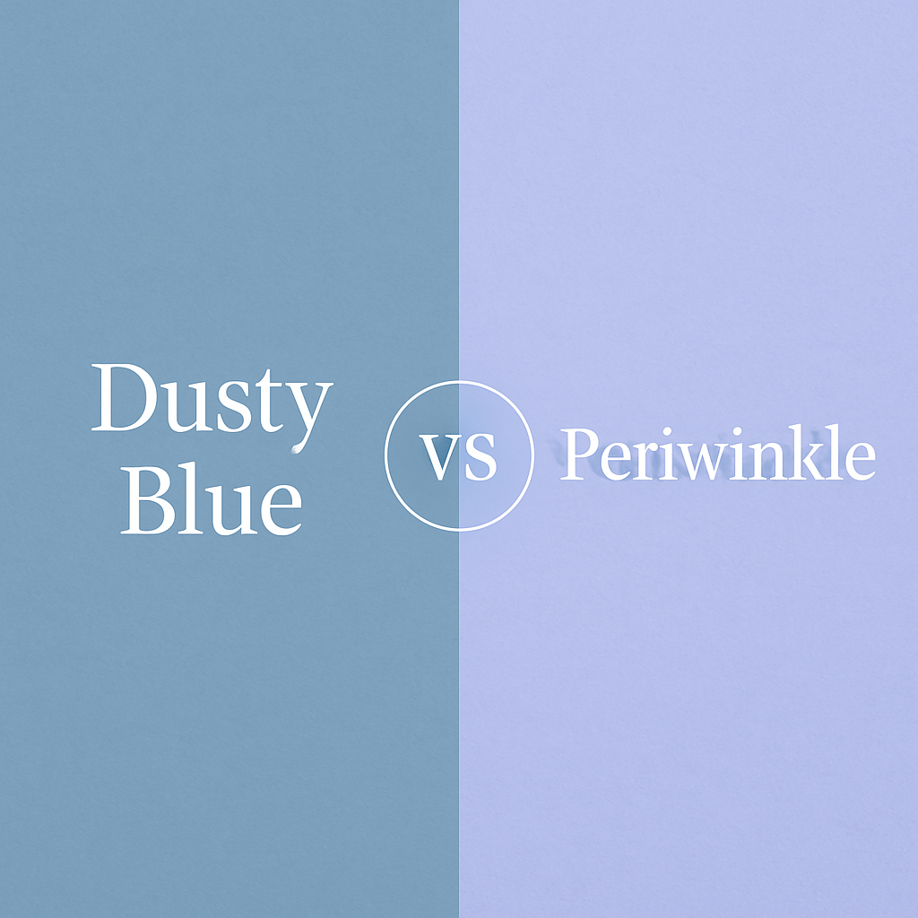
If you’ve ever looked at dusty blue and periwinkle side by side, you’ll notice they both feel soft and elegant—but something about them is clearly different. One leans a little cooler, the other a bit more playful. So how do you actually tell them apart? And more importantly, when should you use each?
In this guide, I’ll explain everything in simple words—with side-by-side color comparisons, usage tips, swatches, and expert insights. Whether you’re decorating a room, choosing bridesmaid dresses, or building a color palette for branding, this article will help you choose the right shade confidently.
What Is Dusty Blue?
Dusty blue is a muted, soft grayish-blue. It’s calm, subtle, and timeless. This shade has been especially popular in wedding themes, home decor, and brand identities that want to feel grounded and elegant.
HEX code: #A8C3D8
Undertone: Cool, grayish
Mood: Peaceful, clean, refined
You can see dusty blue used beautifully in dusty blue wedding color palettes, often paired with neutrals like ivory or metallics like gold.
What Is Periwinkle?
Periwinkle is a soft blue-purple shade—like a mix between lavender and light blue. It’s named after the flower and gives off a dreamy, delicate, and slightly playful vibe.
HEX code: #CCCCFF (can vary slightly)
Undertone: Blue-violet
Mood: Romantic, youthful, imaginative
Periwinkle shows up often in spring weddings and pastel palettes. According to Vogue, it’s also one of the trendiest nail colors for 2025, showing its popularity in fashion and beauty too.


Dusty Blue vs Periwinkle: Side-by-Side Comparison
Here’s a quick comparison between the two shades to help you see the key differences.
| Feature | Dusty Blue | Periwinkle |
| HEX Code | #A8C3D8 | #CCCCFF |
| Undertone | Cool, grayish | Blue with purple |
| Vibe | Calm, classic | Soft, playful |
| Best For | Weddings, branding, home decor | Spring events, kids’ rooms, fashion |
| Popular Pairings | Gold, sage green, ivory | Blush pink, lilac, white |
| Season | All-year, mostly fall/winter | Spring/summer |
The biggest difference is that dusty blue feels more neutral, while periwinkle has a noticeable purple tint. That changes how they work in color palettes.
When Should You Use Dusty Blue?
Use dusty blue when you want something elegant, subtle, and timeless. It’s perfect for:
- Formal weddings
- Professional branding
- Home decor in living rooms or bedrooms
It works especially well in calm color palettes. For example, dusty blue home decor styling often mixes this color with white, beige, or light woods.
Avoid dusty blue if you’re going for a vibrant or energetic theme—it might feel too muted.
When Should You Use Periwinkle?
Choose periwinkle when you want to create a whimsical or light-hearted feel. It’s a great fit for:
- Spring weddings or baby showers
- Creative branding (especially for fashion, beauty, or kids)
- Accent walls or nursery decor
Since it has a hint of purple, it pairs nicely with other pastels like blush pink, lilac, or pale yellow. Check out this color theory breakdown that explores different periwinkle tones and their emotions.
Avoid periwinkle in very formal or minimalist settings—it might look too playful.
Dusty Blue Palette
- Dusty Blue
- Gold
- Ivory
- Sage Green
- Navy
Periwinkle Palette
- Periwinkle
- Blush Pink
- Lilac
- Pale Yellow
- White
These combinations work beautifully across wedding invitations, websites, and even physical products like packaging and fabrics.
Dusty Blue or Periwinkle for Weddings?
If you’re planning a wedding, this decision depends on the season and style you’re going for.
- Choose dusty blue if your theme is modern, romantic, or classic. It’s stunning with greenery or metallics like gold and silver.
- Choose periwinkle if you want a softer, pastel-heavy look with spring or summer flowers like peonies or ranunculus.
In fact, many brides even mix both colors. A dusty blue and periwinkle combination adds a soft variation and gives depth to bridesmaid dresses or floral arrangements.
Which Color Works Better for Branding or Design?
For logos, websites, and brand visuals:
- Dusty blue fits clean, minimalist, and high-end brands. It suggests reliability and calm.
- Periwinkle fits playful, soft, or feminine brands. It brings warmth and friendliness.
A detailed breakdown of color emotions and combinations can be found on Color Psychology, which supports dusty blue’s strong use in emotional branding.
If you’re creating a logo or digital design, also check our guide to best dusty blue color combinations for designers.
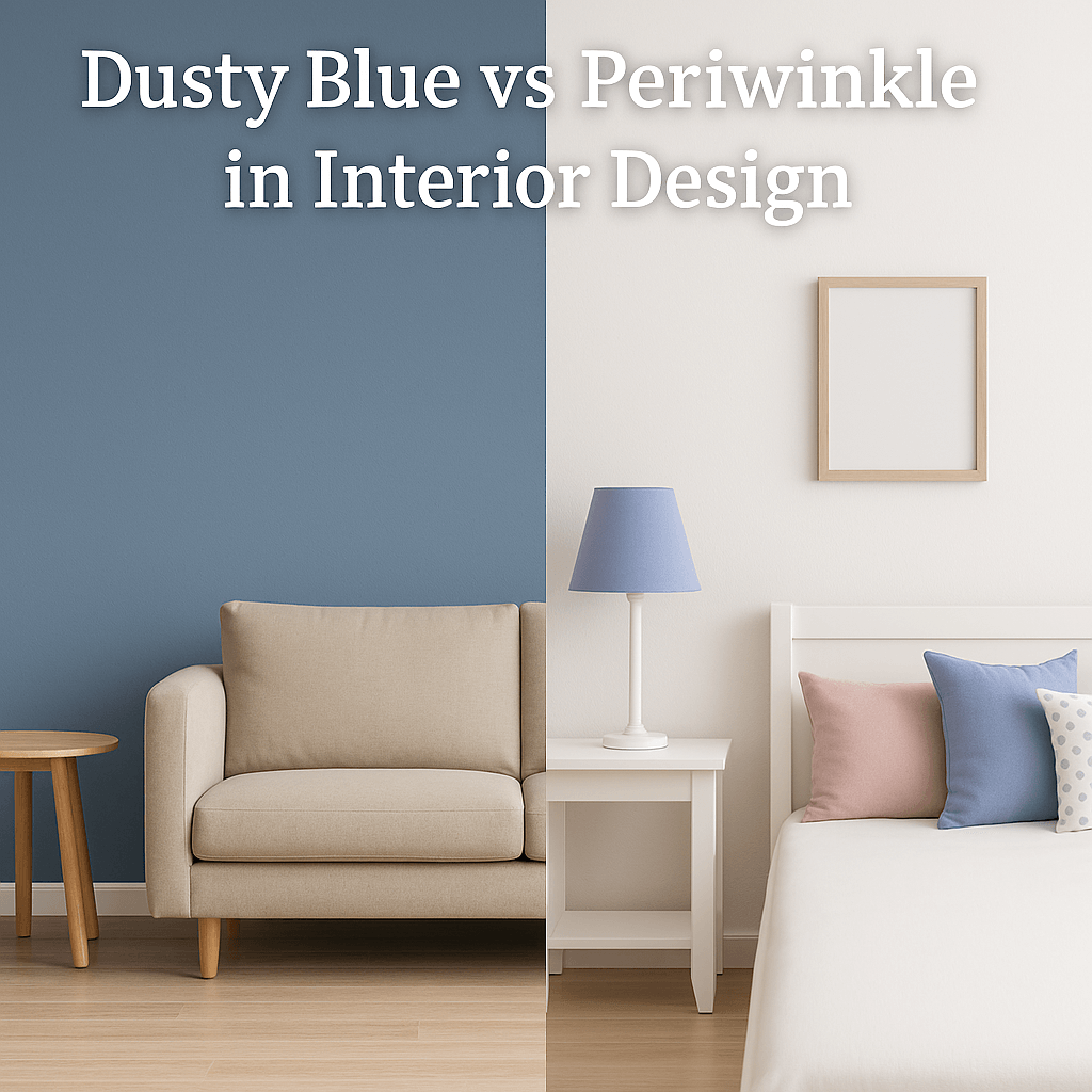
What About Interior Design?
Both colors work in home decor—but differently.
- Dusty blue is excellent for walls, curtains, and large pieces (like sofas). It blends beautifully with white and light neutrals.
- Periwinkle is better as an accent—pillows, artwork, or decorative details—especially in kids’ rooms or creative spaces.
Explore more in our ideas for dusty blue and gold decor themes and how to pair them with neutrals.
Can You Wear Dusty Blue and Periwinkle?
Yes—and they both offer different vibes in fashion.
Dusty blue works well for sophisticated outfits, formal dresses, and year-round style. It pairs beautifully with beige, navy, or metallic accessories.
Periwinkle, on the other hand, brings softness to your wardrobe. It looks amazing in spring dresses, pastel blouses, and even nail polish. It’s especially popular in bridesmaid dresses and baby showers.
You can also mix both colors in one outfit—try a periwinkle blouse with dusty blue jeans or accessories for a dreamy, coordinated look.
Can Dusty Blue and Periwinkle Be Used in Graphic Design?
Absolutely. Both shades work well in digital design—but choose based on your tone.
Dusty blue is great for professional websites, elegant branding, and modern packaging.
Periwinkle suits more playful or artistic designs, especially for beauty, wellness, or children-focused brands.
Many designers use periwinkle as a highlight color with dusty blue as a base for contrast and balance.
Final Thoughts: How to Choose Between Dusty Blue and Periwinkle
Still unsure? Here’s a quick cheat sheet:
| If You Want… | Choose This |
| A neutral, calming look | Dusty Blue |
| A romantic, pastel vibe | Periwinkle |
| To use gold or navy | Dusty Blue |
| To use blush or lilac | Periwinkle |
| Something timeless | Dusty Blue |
| Something playful | Periwinkle |
Both colors are beautiful—and you can even use them together in modern, soft-toned designs.
FAQ: Dusty Blue vs Periwinkle
Q: Is dusty blue more modern than periwinkle?
Yes. Dusty blue feels cleaner and more modern, especially in minimal designs.
Q: Can you mix dusty blue and periwinkle in one palette?
Absolutely. They work well in weddings and pastel-based designs, especially with neutrals.
Q: Is periwinkle warm or cool toned?
It’s cool-toned but has a hint of warmth because of the purple hue.
Q: What season fits each color best?
Dusty blue is all-season. Periwinkle shines in spring and summer.
Want to Use These Colors in Your Project?
I’d love to hear which one you prefer—or if you’ve used dusty blue or periwinkle in your own decor, design, or event. Let me know in the comments!
Hi, I’m Anwar Malik — a design lover and website creator who’s always been drawn to soft, timeless colors like dusty blue. I started this site to share ideas and inspiration for anyone who loves using calm, elegant tones in fashion, decor, or events.
With my background in web development and visual styling, I enjoy turning color ideas into helpful content. Whether you’re planning a wedding or just looking for styling tips, I hope you find something useful and beautiful here.