Some colors just feel right — they don’t shout for attention, but they leave an impression. Dark dusty blue is one of those rare shades that manages to be both timeless and fresh. It brings together the softness of gray, the depth of navy, and a quiet, almost calming presence that works across fashion, interiors, weddings, and even hair.
In this guide, I want to share everything I’ve learned and loved about this color. Whether you’re picking out a paint color, planning a wedding, or trying to match a dress, this deep shade of dusty blue has something to offer.
What Is Dark Dusty Blue, Really?
If you’ve ever looked at a navy blue and thought, “I wish it were a bit softer,” you’re already halfway to dark dusty blue. It’s not a true navy, and definitely not a bright blue either. It’s muted, with hints of gray or slate underneath — the kind of shade that instantly makes things look a little more refined.
It’s easy to confuse this color with steel blue, slate blue, or even smoky gray. But dark dusty blue has its own personality. It sits in a comfortable space between bold and neutral. That’s what makes it so easy to use — especially if you’re drawn to cooler tones but want something a bit more modern.
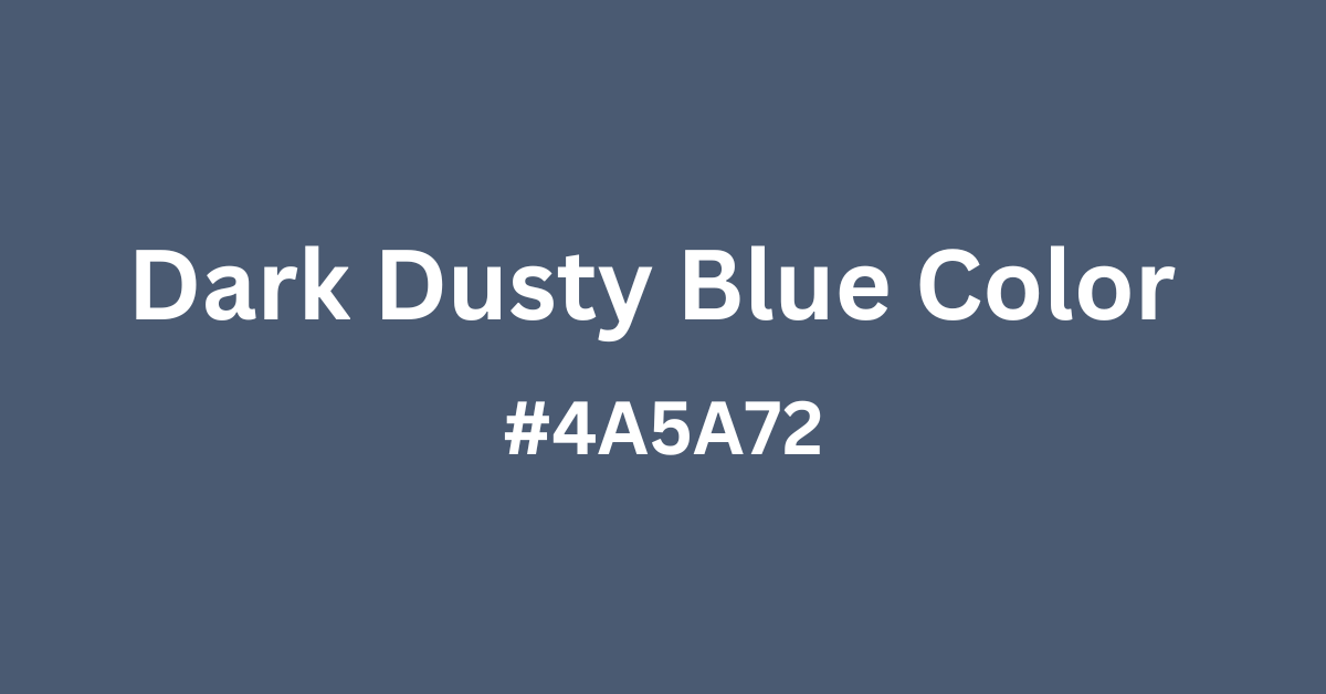
The Dark Dusty Blue Color Code
If you’re designing something on screen or need the color for a Canva project, having the right dark dusty blue color code is essential.
Here’s a solid starting point that captures the essence of this shade:
- HEX:
#4A5A72 - RGB: 74, 90, 114
- HSL: 220°, 21%, 37%
This isn’t a strict standard, because “dark dusty blue” isn’t a single formula. You’ll find slight variations depending on the use — home paint, digital design, fabrics, or fashion. But the version above is a balanced blend of coolness and depth.
If you’re working on a brand design or digital palette, you might want to test a few variations and see what works best alongside your other colors.
What Is the Official Name for This Shade?
There’s no one-size-fits-all dark dusty blue color name. Unlike Pantone or web-safe colors that come with standardized labels, this one tends to shift a little between industries.
You might see it sold or labeled as:
- Dusty Slate
- Moody Blue
- Muted Navy
- Stormy Blue
- Faded Indigo
In paint catalogs, it often shows up as a variation of “Slate Blue” or “Steel Gray.” In fashion, it might simply be described as “Dusty Blue (Dark).” And if you’re shopping for dresses or suits, some brands just call it “Charcoal Blue.”
That flexibility can be frustrating — but it’s also part of what makes the color interesting. It’s adaptable.
Dark Dusty Blue in Paint: A Calm, Elegant Wall Color
One of the most common ways people discover this color is when they’re looking for a good paint for bedrooms, dining rooms, or living spaces. And it makes sense. Dark dusty blue paint gives you all the sophistication of navy, but without the heaviness.
It works especially well in:
- Bedrooms (paired with crisp white bedding or natural wood tones)
- Dining rooms (with brass accents or beige upholstery)
- Offices (to create a focused, peaceful atmosphere)
Paint brands often have their own version of this shade. Here are a few close matches you might want to check out:
- Sherwin-Williams “Smoky Blue”
- Benjamin Moore “Solitude”
- Behr “Admiral Blue”
These aren’t perfect matches for every room — so I recommend grabbing a few testers and checking them in natural and artificial light. Dusty blues can lean cooler or warmer depending on the time of day and how much light your space gets.
Choosing a Dark Dusty Blue Dress
There’s something really special about a dark dusty blue dress — it feels elegant but not too formal, soft but still bold. If you’re shopping for a dress in this shade, you probably already know how versatile it can be.
For casual outfits, look for cotton or linen pieces in darker dusty blues — they pair beautifully with white sneakers, tan sandals, or neutral accessories.
For more formal settings, like weddings or evening events, velvet or satin really bring out the richness in this color. Pair it with gold or pearl jewelry, and the whole look feels classic without trying too hard.
This shade also works really well for transitional seasons — fall and spring especially. It holds its own next to burnt orange in the fall, or paired with blush pink in the spring.
Dark Dusty Blue Bridesmaid Dresses
If you’re planning a wedding and want something romantic but not overdone, dark dusty blue bridesmaid dresses are an excellent choice. The color brings a sense of calm and sophistication, and it flatters most skin tones — which makes styling your entire bridal party easier.
What I like most about this shade for bridesmaids is that it doesn’t fight with other elements. It gives your florals and venue details room to shine, while still holding its own. It’s especially beautiful for fall and winter weddings, paired with florals in ivory, burgundy, or sage.
A few style tips if you’re going this route:
- Mix up the fabrics. Chiffon gives a soft, flowing look; velvet brings warmth and richness for colder months.
- Use tonal variety. Don’t stress about getting all dresses the exact same tone. Slight variation in the “dusty blue” range actually adds depth.
- Pair with metallics. Gold shoes, champagne accessories, or even soft silver can bring the whole look together.
You’ll find a wide range of options on sites like Azazie, Birdy Grey, or even custom listings on Etsy. Just make sure to order swatches first — this color can look different in photos depending on lighting and texture.
Is There a Pantone Match for Dark Dusty Blue?
This is one of those “almost, but not quite” situations. There’s no official Pantone called “dark dusty blue,” but there are several swatches that come close — especially if you’re trying to match fabric, branding, or printing.
Here are a few Pantone shades that might work depending on the tone you’re after:
- Pantone 7545 C – A dark, steel-toned blue with slight gray undertones
- Pantone 5405 C – A soft navy that sits nicely between dark and muted
- Pantone 652 C – More of a dusty, faded medium blue (a little lighter, but great if you’re blending tones)
When working with designers or printers, bringing one of these codes to the table can help avoid confusion. Again, dusty blue is a spectrum — and “dark” is subjective — so you’ll want to be clear about the exact mood and tone you’re going for.
Light Dusty Blue vs. Dark Dusty Blue: What’s the Difference?
If you’re deciding between light dusty blue and dark dusty blue, it really comes down to the feeling you want to create.
Light Dusty Blue
- Feels airy, soft, and romantic
- Works beautifully in spring weddings, baby rooms, or feminine branding
- Can sometimes fade into the background if not balanced with contrast
Dark Dusty Blue
- Feels deeper, richer, more grounded
- Works better in formal settings, cozy interiors, or fall/winter weddings
- Offers more contrast without being harsh
If you’re decorating a room or putting together a wedding palette, try using both. A tonal palette built around dusty blues (from light to dark) is incredibly elegant and visually cohesive.
Think of it like denim: a light-washed chambray shirt and a deep indigo pair of jeans live in the same color family, but bring totally different vibes. It’s the same idea here.
The Unexpected Trend: Dark Dusty Blue Hair
Here’s something a little more unexpected — dark dusty blue hair has become a niche but stunning trend in the last few years.
Unlike bright blues or aquas, this shade feels grown-up and subtle. It’s often achieved by mixing a navy base with soft gray tones, creating a smoky blue that can be worn in full color or just as an accent (like lowlights or balayage).
It works particularly well on people with cooler complexions, and it fades beautifully into steely silver over time. If you’re not ready to go full color, try a semi-permanent gloss or ask your stylist for a blue-gray toner over dark blonde or light brown hair.
Pro tip: This color takes maintenance. Use sulfate-free shampoo, tone regularly, and avoid heat styling too often if you want the shade to last.
Where to Use Dark Dusty Blue in Your Life
By now, you’ve probably seen just how flexible this color is. But here’s a quick list of areas where it works particularly well:
In the Home
- Walls: Bedrooms, dining rooms, and powder rooms
- Decor: Cushions, vases, rugs, or artwork
- Kitchens: Cabinetry or tiling paired with brass hardware
🔗 Related: Dusty Blue Home Decor Ideas
In Fashion
- Evening dresses, jackets, sweaters, and formal suits
- Paired with tan, white, or gold for everyday wear
- Rich textiles like velvet or wool for added texture
In Weddings
- Bridesmaid dresses, floral ribbons, table runners
- Works as both a main color or a secondary tone
- Can be styled modern, rustic, romantic, or formal
In Graphic Design
- Backgrounds or accent colors for websites and brands
- Logo design for calming, trustworthy vibes
- Great paired with off-whites, taupes, or dusty pinks
Final Thoughts
The thing I love most about dark dusty blue is how quietly powerful it is. It doesn’t demand the spotlight, but when you see it in the right setting — a velvet dress, a painted accent wall, a winter wedding bouquet — it steals the show in the best way.
It feels mature without being stuffy. Calm without being cold. Stylish without trying too hard.
Whether you’re painting your walls, choosing bridesmaid dresses, or just refreshing your wardrobe, don’t overlook this shade. It’s one of those colors that will still feel right five years from now — and honestly, that’s pretty rare.
FAQs About Dark Dusty Blue
What’s the best way to describe dark dusty blue?
It’s a muted, gray-toned blue that falls between navy and slate. Elegant, cool-toned, and deeply versatile.
Is dark dusty blue warm or cool?
It’s definitely on the cool side, but the gray undertone keeps it from feeling icy or flat.
What colors go well with dark dusty blue?
Ivory, soft beige, muted blush, sage green, gold, charcoal, and dusty lavender all pair beautifully.
Where can I use it in small spaces?
Try an accent wall, entryway cabinet, or bathroom vanity. Pair it with white tile or brass for contrast.
Is it suitable for branding or digital design?
Absolutely. It’s professional, calming, and modern — ideal for wellness, lifestyle, design, or creative brands.
Want to explore more dusty blue inspiration?
Check out the full Dusty Blue Color Guide or use our Dusty Blue Palette Generator to build your own perfect combination.
Hi, I’m Anwar Malik — a design lover and website creator who’s always been drawn to soft, timeless colors like dusty blue. I started this site to share ideas and inspiration for anyone who loves using calm, elegant tones in fashion, decor, or events.
With my background in web development and visual styling, I enjoy turning color ideas into helpful content. Whether you’re planning a wedding or just looking for styling tips, I hope you find something useful and beautiful here.